
GIS Tool: Shadow Impact Analysis
/
A GIS workflow for analyzing hours of shade for a potential new (or existing) garden, using the Shadow Impact Analysis tasks provided from Esri in their Development Impact Analysis solution.
Read MoreA GIS workflow for analyzing hours of shade for a potential new (or existing) garden, using the Shadow Impact Analysis tasks provided from Esri in their Development Impact Analysis solution.
Read MoreWe’re on break, but we’re coming back this summer and we’re gonna be better than ever!!!
Read MoreFind out how Jen the Magical Mapper has been doing on her Plastic Free July challenge!
Read MoreWe’re postponing our episode until June 16th and we plan on having it be a shorter episode that will talk about the Plastic Free July Challenge
Read MoreI struggled a lot with cartography when I was starting out. TBH, I still struggle with it today, after doing it for almost 25 years. I’m not an expert, but I’d like to share some resources that have been helpful for me over the years.
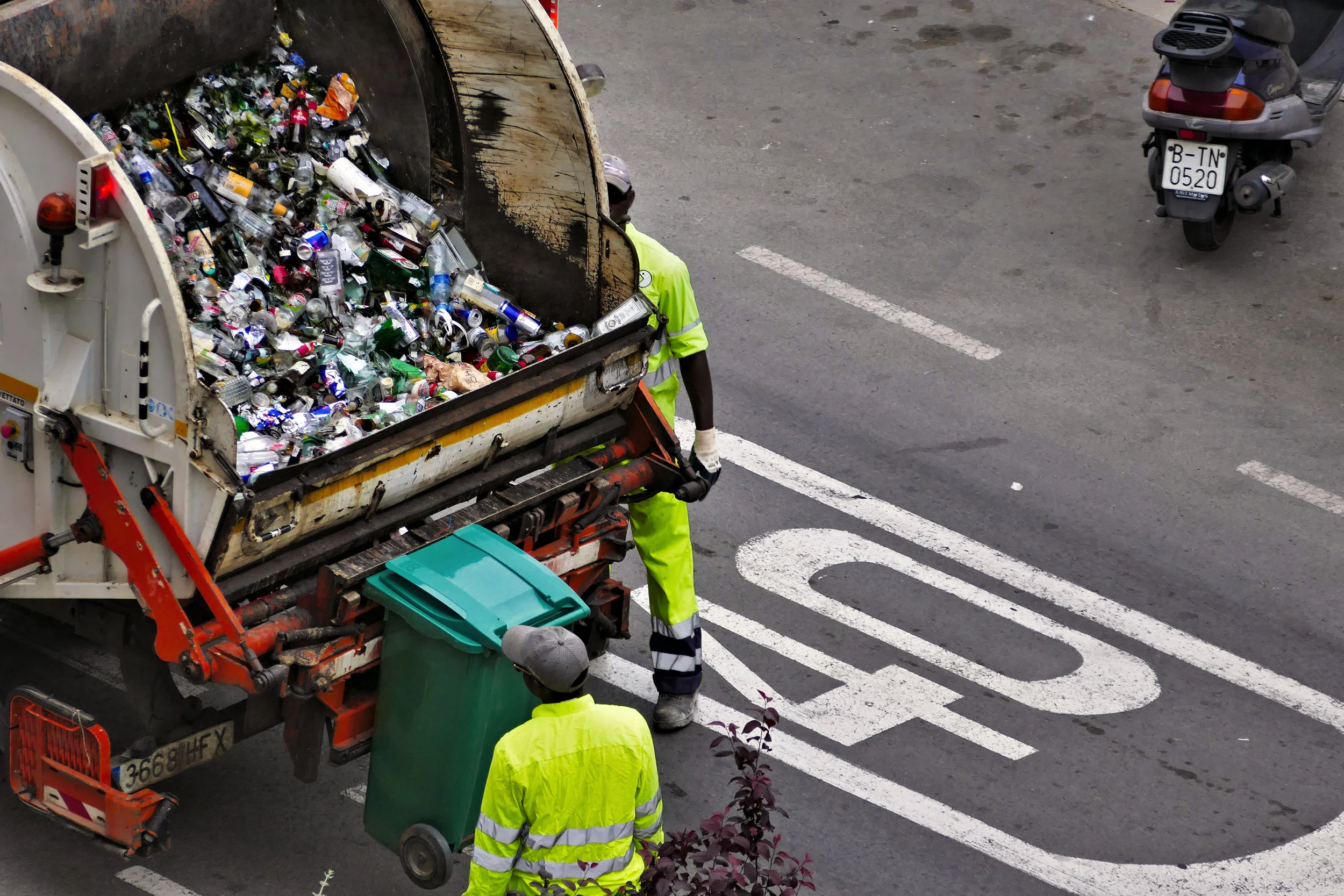
Read MoreIn this month’s episode, we cover how to use the Routing tool to be more efficient in your recycling collection.
Read MoreLearn about dashboard options from Tableau and Esri’s Operations Dashboard.
Read MoreFlow networks (also known as geometric networks) help prioritize fish passage barrier removal.
Read MoreThe Identity tool creates a geometric intersection of two map layers, creating a new data set that has the attributes of both original layers, along with new geometry split where the two layers overlap. Let me describe it with an example. First, a little background.

Do you know your identity?
The Identity tool was just one of many tools used in Phase 1 of the Beach Strategies project. This project was discussed in the GIS segment of Episode 13: Knights of the Nearshore.
The Department of Ecology has a Coastal Zone Atlas, which is a GIS mapping tool with many layers of data. However, the data is pretty coarse and in some cases not very accurate, and it is not very easy to use.
To help solve this problem, a project called Beach Strategies was initiated. This is a two phase project which is in the second phase now. It was initiated and funded by the state.
Phase 1 was all about collecting the data and was completed in 2017. New tools and better sources were used to map historic feeder bluffs, shoreline armoring in pilot areas, drift cells, and more coastal features. There is a video describing GIS data created in Phase 1, along with potential uses of the data.

These cool cats know their identities!
The Identity tool was used in the Beach Strategies project to split the drift cell lines by parcel lines, so one single drift cell was split into multiple drift cell segments based on parcel boundaries, and the parcel ID and attributes from the parcel layer were added to the new drift cell segments. This is useful information later for outreach efforts. The Identity tool is easy to run and only requires a few inputs, but it does require an advanced license of the Esri desktop software.
Phase 2 of the Beach Strategies project is about developing strategies and easy to use decision making tools. Phase 2 is supposed to wrap up later this year, and the GIS-based decision making tools will be available on the WDFW website. Since it doesn’t exist yet I can’t link to it, but I’d check here. Be on the lookout for that!

A Bayesian network - it’s complicated…
As discussed in Episode 12 of the podcast, a Bayesian network is a model that brings known factors as well as unknowns and degrees of certainty of your data into a prediction model. It’s pretty complicated (at least for me), but it may be useful to some of you who are more knowledgeable about probability theory!
A Bayesian network model is something mostly used in academia right now (see academic papers and journal articles here, here, and here, and even notes from a Stanford class here and an older tutorial here), but Esri, QGIS and others are incorporating tools to be able to more easily do this type of modeling inside of GIS software.

We’ve got this!
A few Esri desktop software tools that use this model include Class Probability which is run against a raster image, Empirical Bayesian Kriging which requires a license of Geostatistical Analyst to run, and Maximum Likelihood Classification which requires the Spatial Analyst extension.
QGIS is a free, open source GIS software. There is a plugin called the PMAT (probabilistic map algebra tool) that users can download in order to integrate Bayesian network models with their geospatial data.
Mark Altaweel wrote a much better article over at GIS Lounge, so why not head over and read that for more information!
If I got anything majorly wrong or if you use this type of modeling in your work, please let us know in the comments below!
Learn about GIS styles and layers from the Magical Mapper!
Read MoreIn Episode 9 (Fire Must Burn), I talked about geodatabase templates.
There are a lot of geodatabase templates for fire and incident command, but also for a lot of other things like general local government and utilities. These were mostly developed by groups of experts to include the most important and common attributes.
The benefit of using templates is that the user community and experts have already developed them so you can get started with data collection more quickly. You can also easily share data with other jurisdictions, agencies, or groups. This is especially important in emergency response situations. This doesn’t mean you can’t modify or add to the templates, but if you change existing attributes (data fields) it can become more difficult to collaborate with others.
Geodatabase template contents can vary, but can include things such as different layers with attributes (some may be organized into feature datasets), tables, topology and geometric networks. Some may come with symbology files as well. For those of you who don’t know what those things are, I’ll explain them in future episodes/blog posts.
It’s easy to download and import these templates. They typically come as .xml schema files, and you create an empty new geodatabase and then import the schema. GIS magically does the rest for you! You may still need to set up permissions and other settings if you’re using an enterprise geodatabase, but everything else is ready to go.
Here are a few resources to get you started:
Esri Data Models
Facilities Information Spatial Data Model
Do you know of others? If so, leave them in the comments!

Point Map of Brewery Locations from the Open Beer Database
A hot spot analysis, or the resulting heat map, takes a set of points and renders them to show “hot” and “cold” spots based on the points. In the example to the left, brewery points were plotted. By just looking at a map with points, I can potentially pick out areas that I think may have higher concentrations of breweries, but it’s hard to tell for sure. I might think the East Coast around Philadelphia has the highest concentration.

Heat Map of Brewery Locations from the Open Beer Database
I then took the same set of data but applied the heat map style in ArcGIS Online to show areas with significantly higher numbers of breweries in white, yellow and red, and a significantly lower number of breweries in darker to lighter blue. I can easily see that St. Louis, Denver and San Francisco all have higher concentrations of breweries than Philadelphia!
In episode 8, we talked about using hot spot analysis to see how fish were using a newly restored habitat site. With a hot spot analysis, you can either get results based on absence or presence, as in the beer example, or weight your points and use the weighted values to determine the significance of presence. In ArcMap, if you just want to see areas the fish are present, you would use the optimized hot spot analysis tool. This will give you results that look similar to the beer map, and will just show where fish are present in higher and lower concentrations. If you want to not only see where the fish are present, but count the areas they spend more time as having higher significance, you would want to use the hot spot analysis tool.
If you just want a quick map showing hot spots where fish are present but don’t want to mess with these tools, you can upload your data to ArcGIS Online, add it to a map, and symbolize it with the heat map symbology, as I did with the brewery locations. ArcGIS automagically does the analysis for you. You of course have more control when you use the tools in the desktop software. If you do want to have more controlled results, I suggest checking out the help pages to get more information, because I’m definitely not an expert in hot spot analysis (although the Poop Detective thinks I should be an expert at all things GIS or even remotely related to GIS since I’ve been working with it for almost 23 years). Happy Heat Mapping!
We talked in episode 2 about GPS units and their varying accuracies, and in episode 7 I talk about using GPS units to navigate back to the locations you GPS-ed.
As you may know, navigating back to a specific site or point can be a critical part of the process in certain studies, like water quality monitoring. If you’re able to get back to the general area that might work for some studies, but if you need to know which outfall pollution is coming from so you can trace it back to its source, getting back to the exact outfall is important.

Just as with collecting data, getting back to the same point also requires a higher degree of accuracy.
In almost all cases I can think of, you can use the same device or application you used to collect the data to get back to the feature. You can also get points taken by someone else and load them into your GPS unit or into an application such as Collector for ArcGIS (making sure the accuracy of your device is appropriate for your needs and that the points were collected to the degree of accuracy you need also) and navigate back to the spot.

Mapping grade GPS units don’t typically navigate you using turn-by-turn directions (they aren’t Siri), but show you where you are in relation to the point you want to get to. You can put other background information onto your GPS unit or into your mapping application to assist you in finding your point (such as aerial photography, roads, and water bodies), but you will need to use your own navigational skills to get there in most cases.
You’ll need to look up instructions for your specific device and/or application. The function is typically called wayfinding or navigation or something similar. Here are a few links to get you started.
If you use a Trimble device with TerraSync, see Chapter 7 in their documentation.
Perhaps your device uses ArcPad - they have a help page for the navigation toolbar.
Garmin units also have the capability to add and navigate to waypoints, but each point must be added manually. I would also caution that Garmin units are meant for recreation, not mapping.
Do you use a different device or have a different workflow? Let us know in the comments!
NDVI stands for Normalized Difference Vegetation Index, but it’s basically a magical way to determine vegetation presence and overall health. NDVI is a way to analyze different bands in a multispectral image (basically a satellite or aerial image with at least the red visible light band as well as the near infrared band) to determine the ratio of visible light absorbed and near-infrared light reflected (by chlorophyll). The results represent vegetation presence and overall health. The nice thing about GIS is that if you have an image with these two bands present, there’s a tool that does all of the calculations for you!

Or you could train cats…
All you have to do is add your image into ArcMap and open up the Image Analysis window.
Make sure to open the Image Analysis Options and specify which band is your red and which is your infrared. If you want to see the scientific value for each pixel, also specify that here.
In the Processing section of the Image Analysis window there’s a button with a leaf on it - this is the NDVI button.
Make sure your image is selected in the top part of the window and then click this button.
This automagically calculates the NDVI of your image and shows you your vegetation health.
If you’ve selected to show the scientific value, you can use the identify tool to click on a pixel in your image and the value will give you an idea of your vegetation health.
Scientific values for NDVI range from -1.0 to 1.0.
Negative values are mainly generated from clouds, water, and snow, and values near zero are mainly generated from rock and bare soil. Very low values (0.1 and below) of NDVI correspond to barren areas of rock, sand, or snow. Moderate values (0.2 to 0.3) represent shrub and grassland, while high values (0.6 to 0.8) indicate temperate and tropical rainforests.
We’re up where all the cool kids go for podcasts (we think?)! Time to take a listen!
Read MoreLast time I talked about the buffer tool, which is one geoprocessing tool.
In episode 4 I talk about another one, the Union tool!
The Union tool takes two or more polygon layers and chops them up based on common attributes. For example, if you had a parcel of land with two soil types on it, it would split the parcel in two based on the soil types and each new polygon would contain the attributes of the parents. So one polygon would have the first soil type and the parcel number, and the second polygon would have the second soil type but the same parcel number.

This is a useful step in performing analysis such as determining suitable habitat for a particular species. So let’s say you are determining where suitable habitat for the magical mapper cat (a new species I just made up).

potential Magical mapper cat habitat
You know that the magical mapper cat doesn’t like urban areas, or deserts, but prefers rural, forested landscapes. From this, you know one of the GIS layers you need for your analysis is land cover.
Another thing you know about the magical mapper cat is that it must live on land within 20 miles of a saltwater shoreline. For this, you need a shoreline layer, and you could use the buffer tool to buffer the shoreline by 20 miles, clip out just the land within that area, add an attribute of present or something like that, and use the resulting map layer as your second input to the Union Tool.
To keep this relatively simple, the only other factor the magical mapper cat requires is a large enough area with a soil type ideal for growing fruits and vegetables, because the magical mapper cat doesn’t eat meat. For this, you need a soils layer.
The next step in your analysis would be to union your three layers together (the three layers being land cover, shoreline land buffer, and soils).
Once the union tool cuts your polygons down and adds them together, you can then query your new unioned layer for polygons that are at least a certain size (let’s say 5 acres), is in a forested environment, and has soils of vegetable growing power (you’d actually need to know what the specific types of soils were unless your soils layer already had a vegetable growing suitability field).
You can save the results of your query to a new layer, which is the suitable magical mapper cat habitat layer!
This was a simple, imaginary example, but perhaps you can imagine a wildlife biologist performing similar analysis for the wolverine, for example. In order for the wolverine population to grow, they need access to more land, which is only split by an interstate highway. How to bridge the gaps between habitat and increase connectivity? Perhaps by building wildlife crossings?
In episode 3 of the podcast we briefly mentioned spatial catch-per-unit mapping, which is something that Emily Grason (of SeaGrant’s Crab Team) is experimenting with. We hope to catch up with her in the future to see if it was useful to determine how effective their trap placement is for catching European Green Crabs in Washington’s Salish Sea.
Because research has shown that the European green crabs typically stay within tens of meters of their home site, traps have to be set close to them or they can totally be missed. They currently look at simple heat maps of both catch locations and effort (where they are placing traps), which gives them a bit of an idea of how they’re doing, but Emily wants to dig deeper and see if there are ways to tell how efficient they are with their trap placement and maybe how likely they are to catch a crab (or its friend) after sighting it.
She’s not sure how well it will work, but her current idea for spatial catch-per-unit mapping looks a little like this:
Where CPUE is high but Effort is low, their trap placement is most effective.
While Amy the Poop Detective apparently needs a nap when I start talking GIS; I hope this information does not put you to sleep! Also, the P. Detective really loves GIS, so I’m not sure why she sleeping every time we start talking about it?!

Anywho, let me explain how this is calculated. The first step is to create a buffer of the crab’s range around each trap that was set (the buffer is 20 meters). Read more about the buffer tool in our other GIS tips associated with this podcast episode. Each day a particular trap is set out is one unit of effort. Therefore, at each trap, the number of crabs caught divided by the number of days the trap was set out equals the Catch-Per-Unit of Energy (CPUE). The CPUE is then divided again by the effort. Where the CPUE is high but the effort (number of days the trap was set) is low are efficient places to trap.
Crab Team can then look at where confirmed sightings have been versus where crabs have been caught to see where they might have gaps in trap placement or where they may not be spending enough time placing traps.
This is just the preliminary analysis that Emily is playing around with to see if it provides useful data that helps them better understand where to place traps in the future. We plan to check in with Emily in the future to see how well her analysis is working and how useful she is finding it.
In episode 3 of the podcast, we talk about the Buf-fer Tool, Buf-Buf-fer Tool.
The buffer tool is one of many geoprocessing tools. Geoprocessing basically functions as a set of tools and a framework to perform analysis, modeling and management of your location data. The buffer tool in particular creates a buffer around an existing point, line, or area feature. For example, in episode 3 we talked to Emily Grason with Crab Team, who uses the buffer tool to create 20 meter buffers around each trap the Crab Team places. The traps are set once a European Green Crab sighting has been verified, and the location of the trap is collected with a handheld GPS unit. That coordinate is what is buffered, and Crab Team hopes they set the trap close enough to be within the crab’s territory (they typically don’t wander far during the summer months) so that the crab winds up in their trap.
To run the buffer tool in ArcMap, you need to specify an input layer (such as trap_locations), an output layer (such as trap_buffers), and either a buffer distance (in this case 20 meters) or a field that contains the buffer distance. There are other parameters, but they are optional and for most situations, cats can just accept the defaults. The tool will run, and a layer containing your buffers will be created, which you can use in further analysis! Easy, peasy! See the map below for a map of imaginary trap locations with their buffers. These traps didn’t catch any crabs, most likely due to the fact that they are imaginary. “Wait the crabs or the traps?” -P. Detective. “Duh, everything is imaginary…if you use your imagination, you can pretend that the coordinate is in the crosshairs in the map, the outer circle represents a very approximate approximation of a 20 meter buffer of each point,” -M. Mapper. Jen the Magical Mapper made this map in the free version of ArcGIS Online, which apparently has VERY limited capabilities (like no buffer tool available).
Always make the most of what you have, unless you can be a caticorn, and then it doesn’t matter how limited ArcGIS online is (cause you’re magical)!
Being the Magical Mapper, I’m often asked about GPS units and why I don’t just use the built-in GPS unit in my smartphone to collect GIS data. While consumer GPS technology is getting better every day, most GIS analysis requires a little bit better locational accuracy. Regular GPS units like recreational GPS units or the chips in smartphones can get you within a few meters if conditions are excellent (estimates are 16 ft. under wide-open skies), but you typically don’t know the accuracy of each point captured (so you know what types of mapping or analysis are appropriate to conduct with your collected data). This article gives a good overview of GPS accuracies, and this blog post explains it in a bit more detail.
Basically, this means that if you’re trying to map a location of an outfall that you’ve tested for poop (er… fecal coliform), and want to get back to it (and not mix it up with other ones in the vicinity), you need a mapping-grade GPS unit and shouldn’t trust your phone (unless you want to make awesome drawings to carry with you).
Mapping-grade GPS units can have accuracies ranging from a few centimeters to within a meter of the actual feature you’re collecting and store the accuracies for each point. With new rules being applied and apps being developed, it’s conceivable that I may use a smartphone one day to collect data…
Most GIS Professionals are still using mapping-grade GPS units, like the yellow Trimble units you may have seen (there are many brands out there but this is the one I’m most familiar with). There are a lot of new versions now that are just a little puck sized device that connects to a tablet or phone via Bluetooth. With with apps such as Fulcrum, or Esri’s Collector or Survey123, you can create a much more user-friendly map or form to use with the GPS unit but still get the accuracy you want. If you don’t care about locational accuracy so much, or if you already have your feature mapped but need to add additional information (or return to take another sample), you can still use these apps to collect data.
Tell us more about how you use GPS in your work on our Facebook page.
Will We Make It Out Alive is a hilarious and educational bi-weekly podcast that engages people, inspires participation in the restoration of the environment, cultivates enhanced use of GIS (geographic information systems) tools, and increases awareness of citizen science opportunities.
A GIS workflow for analyzing hours of shade for a potential new (or existing) garden, using the Shadow Impact Analysis tasks provided from Esri in their Development Impact Analysis solution.
We’re on break, but we’re coming back this summer and we’re gonna be better than ever!!!
We’re postponing our episode until June 16th and we plan on having it be a shorter episode that will talk about the Plastic Free July Challenge
I struggled a lot with cartography when I was starting out. TBH, I still struggle with it today, after doing it for almost 25 years. I’m not an expert, but I’d like to share some resources that have been helpful for me over the years.
In this month’s episode, we cover how to use the Routing tool to be more efficient in your recycling collection.
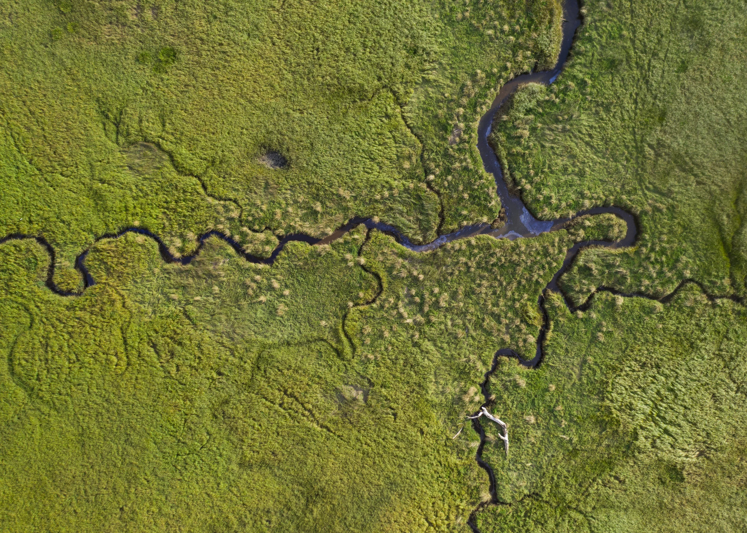
Flow networks (also known as geometric networks) help prioritize fish passage barrier removal.
GIS Professional
CSECL*
Hilarity
*Certified Sediment and Erosion Control Lead


Find out how Jen the Magical Mapper has been doing on her Plastic Free July challenge!